The UBP logo is an amazingly simple yet effective logo as it combines both form and function in their simplest form. The letter U, B and P meaning United Basalt Products are written in 3 grey squares. Not only is the logo easily recognisable but it reminds
us of the company’s historical product: the building block. Now that’s really smart.
Another logo that was craftily designed is CWA. Could there be a simpler way to design the logo and tell the story? Don’t think so. We have this double line flow of the letterings
going from the C to the A representing a flow of water, and of course the color blue to go with it. Also, don’t know if you’ve noticed… but the overall look takes after the oh-so popular brass tap every Mauritian knows. That’s genius.
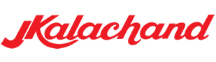
Nothing fancy about this one. But this is one of the most, if not the, most finely executed typographic logo in Mauritius. The kerning has been thought out giving the ensemble unity and still making it easy to read. Use of an italic cursive font makes
the logo act as a signature and gives the letters a dynamic twist. This is initiated by the superposing and kind of symmetric JK. Interestingly enough, the protruded end part of the K reminds a smile (didn’t mention A…n:))
Chantier de Plaisance, a wood & timber wholesaler originating from Plaisance near Rose Hill, has one of the simplest logos ever designed. But how smart it is! Indeed, this geometric shape drawn with a single line represents the C & P of its name.
Furthermore, it reminds us of the roof of wooden houses.
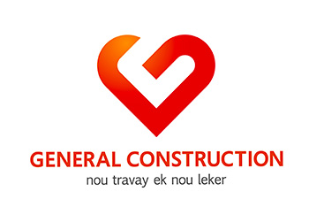
5. General Construction
The new logo of General Construction is really well thought-out, simple & powerful at the same time. The agency has put emotion in an industry that is really manly and technical. Now let’s see it from a graphical standpoint. The G
of General, drawn to represent a heart, stays on equilibrium on the heart’s tip and GENERAL CONSTRUCTION serves as a base. The light orange-red gradient lightens and gives depth to the logo. Of course, the tagline “nou travay ek nou leker†reinforces
the whole concept of the logo. Interestingly enough, the G heart recalls the folded iron bars used on construction sites.